// 001

Building My Portfolio — A Design Engineering Case Study

Design Engineering AI-Augmented Design System Personal Branding

Twenty years of career evolution — from graphic design to UX to design engineering — distilled into a single-file portfolio that is itself the proof of competence. No frameworks. No templates. Just intent, craft, and a conversation with AI.

Role Design Engineer
Timeline Q1–Q2 2026
Type Personal Project — Solo
Stack HTML · CSS · JS · Claude AI
Rico Mello Portfolio — Hero section
// Portfolio — ricomello.ie · 2026

Challenge

Repositioning myself in the European market as a Design Engineer after a 20-year career spanning graphic design, branding, and UX. The portfolio couldn't just show work — it needed to be the work. A tangible demonstration that I can bridge the gap between design intent and technical execution.

Solution

A hand-crafted, zero-framework portfolio built through an AI-augmented workflow — Claude as design and code co-pilot. The visual identity draws from Death Stranding and The Matrix: metaphors for connection-building and seeing beyond the surface. Every design decision maps to a CSS custom property. Every component is intentional.

Impact

The portfolio itself is the strongest case study. It proves design thinking (strategy, visual direction, systems thinking) and engineering capability (semantic HTML, CSS architecture, performance) in a single artefact. The process — AI-augmented design and code — demonstrates adaptability and a forward-looking approach to the craft.

01

Career Context & Positioning

Before touching a single pixel, I needed to answer a fundamental question: what story does this portfolio tell? After two decades in design, the answer wasn't obvious — it required honest reflection on where I've been and where I'm heading.

2006 – 2012
Graphic Design & Branding

Foundational years in visual design, developing an eye for composition, typography, and brand systems across print, identity, and digital media in Brazil.

2012 – 2018
Transition to Digital & UX

Moving from static to interactive. Designing for behaviour, not just aesthetics. Information architecture, user flows, and the shift from making things beautiful to making things work beautifully.

2018 – 2024
UX Design & Systems Thinking

Deep UX work across products, design systems, and cross-functional teams. Building the bridge between user needs and business goals. Information architecture at Logitech. Moving to Ireland, entering the European market.

2020 – Present
Design Engineering

The natural evolution. Not abandoning design, but extending it into code. Understanding that the best design decisions happen when you can prototype, build, and ship — not just hand off.

// Key Insight

The European market values T-shaped professionals who can operate across disciplines. My positioning had to reflect 20 years of accumulated design sensibility while clearly signalling engineering capability. The portfolio couldn't be a Figma export — it had to be code.

02

Visual Direction & References

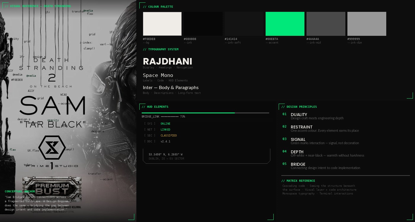
The visual identity needed to communicate duality — design craft and technical depth. I looked beyond the design industry for references, finding the most resonant metaphors in gaming and cinema.

Death Stranding became the conceptual anchor. In the game, Sam Bridges literally builds connections across a fragmented landscape. That's what a Design Engineer does — bridges the gap between design and engineering, between intent and implementation. The game's HUD elements, scan-line effects, and utilitarian aesthetic informed the portfolio's visual language.

The Matrix added the second layer. The cascading code, the idea of seeing the underlying structure beneath the surface. As a design engineer, I operate at both levels — the visual layer users experience and the code architecture beneath it. The code cascade background, the monospace typography, and the terminal-inspired interactions all trace back to this reference.

These references translated into concrete design decisions:

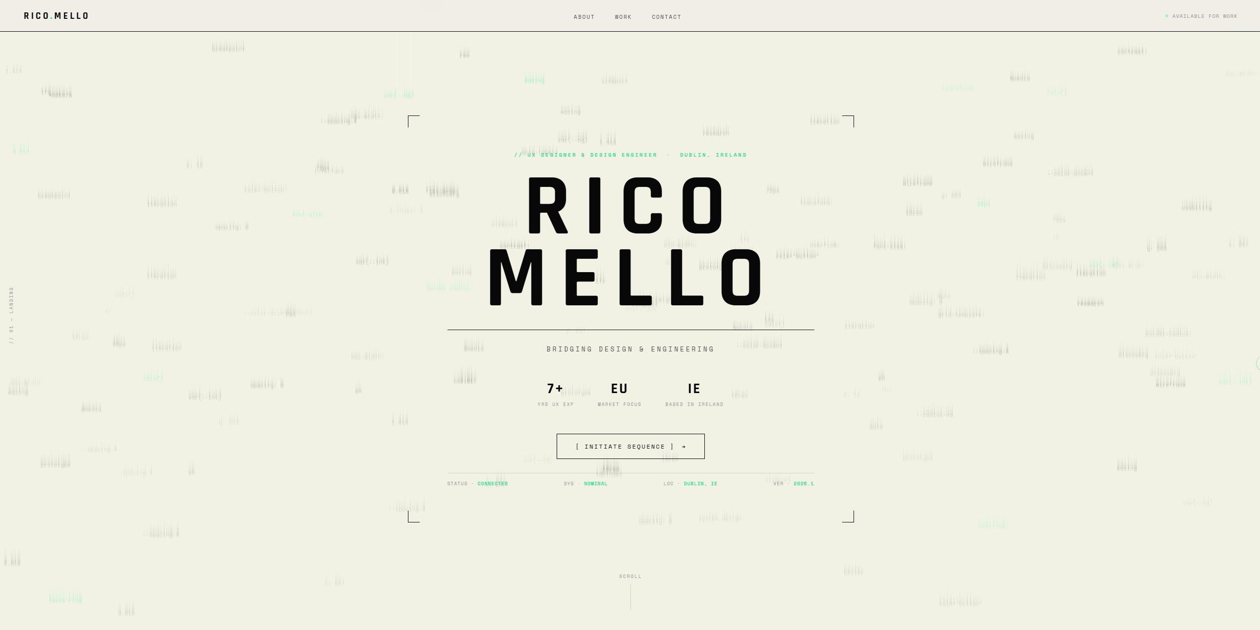
  • Off-white background (#F0EDE8) rather than pure white — warmth with restraint
  • Near-black (#080808) instead of pure black — depth without harshness
  • Bio-luminescent green (#00E87A) as the brand accent — signal, not decoration. Paired with a darker variant (#008C50) for text on light surfaces (WCAG AA)
  • Corner brackets and HUD elements as structural ornaments
  • Custom cursor with ring — precision, intentionality
  • Code tokens as the cascade background — design is code, code is design
Visual references moodboard — Death Stranding HUD, Matrix code cascade, colour palette, typography samples
03

Design System

Rather than designing in Figma and translating to code, the design system was built directly in CSS custom properties. Every token, every component, every spacing decision lives in code from the start — because that's where it matters.

The full design system is documented below, rendering live tokens and components as proof of the system's coherence.

Design System
— Tokens & Components

The complete visual language of the portfolio, built as CSS custom properties. Every decision has a reason. Every token maps to intent.

Tier 01

Foundations

Primitive tokens — the atomic values every component inherits. Colour, typography, spacing, motion, letter-spacing. Sourced directly from global.css :root.

// Colour Tokens
Surfaces — backgrounds & inverted sections
--bg
#F0EDE8
Primary background. Warm off-white — avoids clinical sterility, feels crafted.
--ink-soft
#141414
Dark surface. Case-study dark sections, classified frames, inverted panels.
Inks — text hierarchy
--ink
#080808
Primary text. Near-black — softer than pure #000, more depth.
--ink-mid
#4A4A4A
Secondary text. Descriptions, supporting body content.
--ink-dim
#6B6B6B
Tertiary text. Meta labels, fine print. WCAG AA on --bg (4.75:1).
Signals — semantic states
--accent
#00E87A
The signal. Links, labels, status, focus. Bio-luminescent green from Death Stranding. Used on dark surfaces where the glow earns its keep.
--accent-on-light
#008C50
Darker variant of --accent for text and labels on the off-white --bg. Contrast ratio ~4.6:1 — passes WCAG AA for small text. Same hue family, calmer luminance.
--error
#FF3333
Form validation errors & restricted / NDA / classified content. Decoupled from portfolio identity.
Alpha derivatives

Overlays, borders and tints use rgba() derivatives of the base tokens (rgba(8,8,8,X), rgba(240,237,232,X), rgba(0,232,122,X), rgba(255,51,51,X)). Not tokenised individually — treat them as utility overlays, not discrete tokens.

// Typography Scale
Display / H1
Rajdhani 700 · clamp(2.5rem, 6vw, 4.5rem)
Font: Rajdhani · var(--f-display) · Google Fonts
RICO MELLO
Heading / H2
Rajdhani 700 · 2rem
Font: Rajdhani · var(--f-display)
Selected Work
Subheading / H3
Rajdhani 600 · 1.5rem
Font: Rajdhani · var(--f-display)
Design System & Architecture
Body
Inter 300 · 1rem / 1.8
Font: Inter · var(--f-body) · Google Fonts
Bridging the gap between design intent and technical execution across two decades of creative practice.
Mono / Labels
Space Mono 400 · 0.875rem
Font: Space Mono · var(--f-mono) · Google Fonts
// 001 · FEATURED  —  STATUS · CONNECTED
Micro / Tags
Space Mono 400 · 0.75rem · uppercase
Font: Space Mono · var(--f-mono)
Design Engineering   AI-Augmented   Personal Branding
// Spacing Scale (base: 16px)
4px
0.25rem
8px
0.5rem
16px
1rem — base
24px
1.5rem
32px
2rem
48px
3rem
96px
6rem — sections
// Motion
--ease
cubic-bezier(0.25, 0.46, 0.45, 0.94)
Global easing curve. Subtle ease-out-quad — lands without overshoot. Applied to every transition and scroll reveal.
Duration · short
0.3s
Hover states, cursor shifts, small UI transitions. Fast enough to feel direct.
Duration · reveal
0.6s
Scroll-triggered opacity + translate fades. Long enough to register, short enough not to wait.
Duration · ambient
3s
classifiedPulse on restricted badges, looping atmospheric motion. Always respects prefers-reduced-motion.
// Letter-spacing Scale
--ls-tight
0.05em
near-neutral mono
--ls-base
0.1em
labels · hud
--ls-wide
0.18em
section labels
--ls-xwide
0.22em
restricted badge
Tier 02

Atoms

Single-purpose UI primitives. The smallest functional elements — combine into molecules and patterns.

Buttons
[ Primary ] [ Secondary ]
Tags
Design Engineering UX Research Systems
HUD Elements
STATUS · CONNECTED SYS · NOMINAL LOC · DUBLIN, IE
Custom Cursor
Default — 8px dot + 34px ring
Hover — 5px dot + 44px ring
Status Indicator
Available for work
Tier 03

Molecules

Compositions of atoms into self-contained UI units with their own purpose.

Navigation
  • Work
  • About
  • Contact
Available for work
Rendered on --bg (off-white) to match the live site. Dark mode is not planned for v1 — this surface reflects real usage.
Form Validation
Error state
Your name
ERR // SIGNAL_LOST — Identity field required
Valid state
rico@example.com
// SIGNAL · OK
Phase Timeline
Phase 1
Foundation
Apr — Aug
  • Audit
  • Token base
Phase 2
Refinement
Sep — Dec
  • Components
  • Patterns
Phase 3
Unification
Jan — Mar
  • Governance
  • Handover
Insight Quote Card
Topic Label
“Anonymised stakeholder quote.”
Role Title
Discipline Card
// 01
Discipline Name
Brief description of scope.
Overview Card (Dark)
// 01
Challenge
Auto-numbered dark card with scan lines & corner bracket.
Used in pairs or triples (Challenge / Solution / Impact) on case-study Overview sections. Numbering via CSS counter-increment.
Classified Card
Access Denied
Redacted Content
Sensitive details shown as redacted text inline.
Tier 04

Patterns

Reusable compositions tied to specific content-types — the "shapes" that appear across multiple case studies. Rendered at real usage fidelity (16:9 frame, full meta stack).

Restricted Area Placeholder
Restricted Area Authorized People only Figma · Prototype · NDA
Confidential-asset placeholder used in case-02 (LDS), case-03 (URBS), case-04 (Fior). 16:9 frame matches real embedded usage. Stack: pulsing Restricted Area badge + Authorized People only hint + artefact meta (Tool · Asset · NDA?). Red signal is universal across cases regardless of page accent — decouples "classified" from brand identity.
Tier 05

Effects

Motion & behavioural layers. Hook onto existing atoms/molecules via data-* attrs, live canvas, or CSS transitions. All respect prefers-reduced-motion.

TV Signal Loss
No Signal
Ambient analog-TV interference layer. Scanlines + SVG noise + random band slices + chromatic aberration during 5–8s bursts. Auto-init on .tv-frame. Config baked in tv-glitch.js (no data-attrs). Replaces previous Chiral Network canvas — better legibility, lower CPU, no canvas dependency.
Decoded Badge
Restricted Area
Scramble-to-reveal on viewport enter + glitch burst on hover. Drop data-decode on any element. Powered by decode.js (MODE 1 & 3).
Hover Bloom
Hover to bloom
Border-color + box-shadow transition on confidential frames. Signals affordance on restricted placeholders without overwhelming the ambient state.
Classified Pulse
Restricted Area
3s opacity loop on badges that mark restricted content. Keyframe: @keyframes classifiedPulse. Pairs with var(--error).
// Token Architecture — global.css :root
/* ═══ DESIGN TOKENS — single source of truth ═══ */
:root {
  /* Surfaces & Inks */
  --bg:          #F0EDE8;  /* page surface */
  --ink:         #080808;  /* primary text */
  --ink-soft:    #141414;  /* dark section bg */
  --ink-mid:     #4A4A4A;  /* disabled / dividers */
  --ink-dim:     #6B6B6B;  /* secondary text — WCAG AA 4.75:1 */

  /* Signals */
  --accent:      #00E87A;  /* brand / active state */
  --error:       #FF3333;  /* classified / NDA / form errors */

  /* Typography */
  --f-display:   'Rajdhani', sans-serif;
  --f-mono:      'Space Mono', monospace;
  --f-body:      'Inter', sans-serif;

  /* Layout */
  --nav-h:       64px;  /* fixed nav height */

  /* Motion */
  --ease:        cubic-bezier(0.25, 0.46, 0.45, 0.94);

  /* Letter-spacing */
  --ls-tight:    0.05em;
  --ls-base:     0.1em;
  --ls-wide:     0.18em;
  --ls-xwide:    0.22em;
}
04

AI-Augmented Design Workflow

This portfolio wasn't built in the traditional sense. There was no Figma handoff, no design-to-dev pipeline. Instead, the entire process was a conversation — an ongoing dialogue with Claude where design decisions and code happened simultaneously.

This AI-augmented approach flips the traditional flow: rather than writing specs and translating them sequentially, you describe the intent, review the output, iterate in real time, and shape the result through continuous feedback. The AI handles the boilerplate; I focused on the decisions that matter — visual direction, information hierarchy, interaction patterns, and brand coherence.

Key decisions that emerged through this process:

  • Starting with a single-file HTML approach for speed, then extracting a global.css when the codebase matured
  • Building the design system directly in CSS custom properties rather than in a design tool first
  • Iterating on micro-interactions (cursor, hover states, scroll reveals) through rapid feedback loops
  • Using the AI as a thinking partner for content strategy, not just code generation
  • Treating each session as a design sprint — define intent, execute, review, refine
// On AI-Augmented Workflows

The most valuable aspect of this workflow wasn't speed — it was the ability to stay in the design headspace while producing production code. No context switching between tools. No fidelity gap between mockup and implementation. The design IS the code from the first moment.

05

Iteration & Refinement

The portfolio went through multiple rounds of refinement. Each iteration was driven by a clear question: does this decision serve the positioning strategy?

Things that changed along the way:

  • The initial structure drew from external references, but the visual identity diverged entirely — the references needed to be mine, not borrowed
  • The code cascade background shifted from katakana characters to design/UX tokens — reinforcing the design engineering narrative
  • Typography choices were refined from generic safe options to a deliberate triad: Rajdhani for impact, Space Mono for technical precision, Inter for readability
  • The hero section evolved from a standard introduction to a HUD-inspired data display — stats, status indicators, scan lines
  • Project cards moved from a uniform grid to a featured-first layout with visual hierarchy
  • The hero name gained a Matrix-style decrypt animation — special glyphs scramble before resolving into the final characters, with a persistent subtle green glitch that keeps the name alive
  • Section titles on the landing page received scroll-triggered decode effects with ongoing glitch; case study pages use a lighter glitch-only mode to keep long titles readable without the decode delay
  • Native browser form validation was replaced with a custom DS-themed system — error messages use in-universe language (SIGNAL_LOST, CORRUPTED_SIGNAL, DATA_NULL), with red accent borders, input glitch animations, and proper pattern validation for email format and minimum character lengths

Later iterations addressed scalability and polish:

  • A visual moodboard was composed programmatically — Death Stranding reference imagery, colour palette swatches, typography specimens, HUD elements, and design principles — all generated via Python and Pillow to maintain the dark, utilitarian aesthetic
  • A DS-themed lightbox component was built from scratch: overlay at 92% opacity with backdrop blur, zoom-in/zoom-out cursors overriding the custom cursor system, Escape key and click-outside-to-close, accessible role="dialog" markup
  • Case study CSS was extracted from inline <style> tags into shared external files — reducing each page from ~800 lines of CSS to 4 lines (just the hero gradient colour). Changes now propagate to all case studies simultaneously
  • A comprehensive responsive audit across all six pages revealed a missing tablet breakpoint (768–1024px). Section padding, grid columns, navigation gaps, image heights, and font sizes were all adjusted across three breakpoints
  • Project cards on the landing page evolved from solid gradient backgrounds to screenshot-backed cards with dark overlays, preserving the existing hover effects (scale, scan line, corner brackets) while adding visual context

Things that were intentionally kept:

  • Zero external frameworks — the constraint is the point
  • Single accent colour — restraint over decoration
  • Performance-first approach — no heavy assets, no unnecessary JavaScript. The decode effect uses requestAnimationFrame during its brief run then stops entirely; the ongoing glitch fires one setTimeout every 2–5 seconds with near-zero CPU cost
  • UK English throughout — market-appropriate for European positioning
Portfolio homepage hero section

Landing Page — Hero with HUD elements & code cascade

Work section with project grid

Project Grid — Featured-first layout with scan-line cards

About section with timeline

About — Bio, work history timeline & skills cloud

Contact section with form

Contact — Form with classified/HUD-style footer

// Reflection

What I Learned

Design Thinking Lives in Code

Every CSS custom property is a design decision. Every semantic HTML element is information architecture. The portfolio demonstrates that design engineering isn't about choosing between design and code — it's about doing both with intent. The modular architecture mirrors the same systematic thinking that drives design system work in product teams.

AI Amplifies, Doesn't Replace

AI-augmented work is powerful, but only when you bring strong design opinions to the conversation. The AI accelerated execution, but every meaningful decision was human judgement. The visual metaphors, the restraint, the Death Stranding reference as conceptual anchor: these came from 20 years of design sensibility, not a prompt.

From Monolith to Modular

The project evolved from five self-contained HTML files with ~800 lines of inline CSS each into a modular system: shared stylesheets, paired JS components, and per-page overrides reduced to four lines. A single change now propagates to every case study — the same principle behind any design system.

Three Breakpoints, Zero Frameworks

A full responsive audit uncovered gaps in tablet coverage. The fix introduced proper breakpoints with intermediate values — all achieved with CSS custom properties and media queries. No Tailwind, no Bootstrap, no PostCSS.

Inclusive by Architecture

Accessibility was woven into the build, not bolted on. Semantic HTML throughout, ARIA roles on interactive components, keyboard navigation, visible focus states, and a cursor system that gracefully degrades for assistive tech.

From Portfolio to Practice

This project validated the workflow. The next step is applying the same approach — design system thinking and AI-augmented iteration — to product work. The portfolio itself is proof the process works.